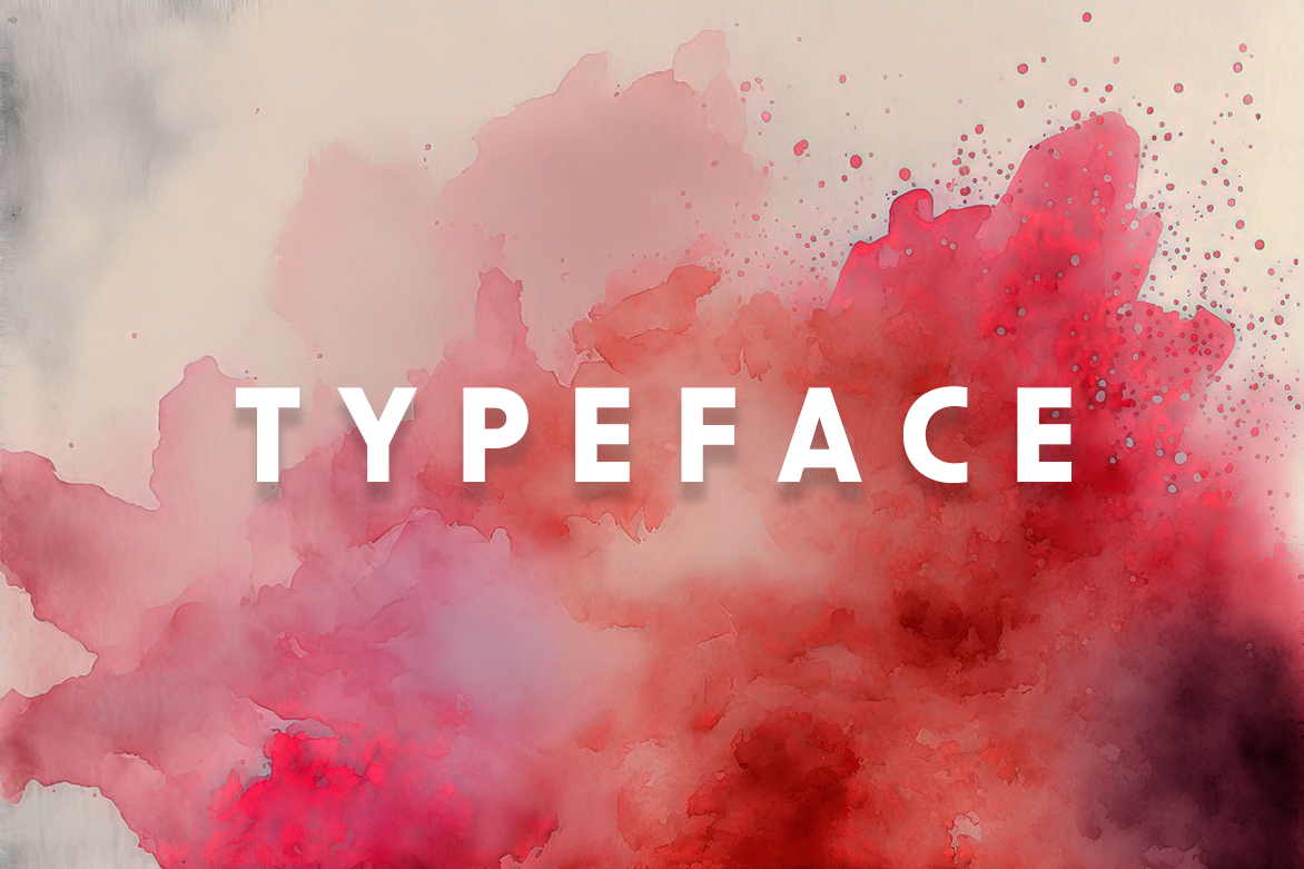
The Importance of Typeface Selection
04/20/2023
Choosing the right typeface is an essential component of any design project, whether it's for a client site, ID, a poster, or a book. The typeface you choose will determine how your content is perceived by your audience and can make or break the overall success of your project. In this post, we'll explore the importance of picking the perfect typeface and how it can impact your design.
First impressions matter in a big way, and the typeface you choose plays a significant role in creating a first impression. Different typefaces have different personalities and convey different emotions. For example, a bold sans-serif typeface like Helvetica can be seen as modern and minimal, while a script typeface like Brush Script can be seen as elegant and refined. Choosing a typeface that matches the tone of your content can help establish a connection with your audience and convey the message you want to communicate.
Legibility is another critical factor to consider when choosing a typeface. The typeface you choose must be easy to read, regardless of the medium. A typeface that is difficult to read or strains the eyes can cause your audience to lose interest in your content quickly. It's essential to choose a typeface that is easy to read in various sizes, whether it's on a small screen or a large poster.
The context of your content is also an important consideration when choosing a typeface. A typeface that works well for a website may not be suitable for a book, and vice versa. The typeface you choose must match the intended medium and the overall design of your project. For example, a typeface with a lot of personality and character may work well for a poster, but it may be too distracting for a book.
The use of color is another factor to consider when choosing a typeface. The color of the typeface should almost always contrast with the background color to ensure readability. Additionally, the color of the typeface can affect the emotional response of your audience. For example, a red typeface may convey a sense of urgency or importance, while a blue typeface may convey a sense of calm or trust.
Finally, the typeface you choose should be appropriate for the audience you're targeting. Different typefaces appeal to different demographics, so it's essential to understand your audience and their preferences. For example, a playful typeface may appeal to a younger audience, while a traditional typeface may appeal to an older audience.
In conclusion, choosing the right typeface is an essential part of any design project. The typeface you choose can impact how your content is perceived, its readability, its context, its use of color, and its appropriateness for your audience. Taking the time to choose the perfect typeface can make a significant difference in the success of your project.
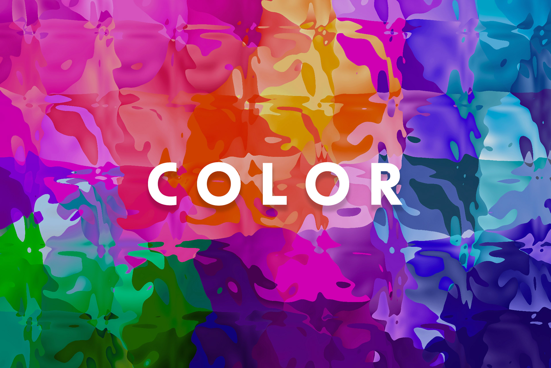
The Importance of Color Selection
05/17/2023
Selecting the proper color schemes in digital design is crucial for effective communication and creating a visually appealing experience. Colors have the power to evoke emotions, convey messages, and influence user behavior. Here's why color selection is important:
Visual Appeal: Colors play a significant role in capturing attention and creating a positive first impression. Harmonious color combinations and balanced contrasts enhance the overall aesthetic appeal of a design, making it visually pleasing to the audience. There is a 70's color scheme trend happening right now and this world definitely needs that comfort and sense of approach-ability right now.
Brand Identity: Colors are an integral part of brand identity and recognition. Consistent use of colors across different design elements helps establish a strong brand presence and creates a sense of familiarity. Choosing colors that align with the brand's values and personality can strengthen brand recognition and recall.
Emotional Impact: Colors have the ability to evoke specific emotions and moods. Warm colors like red and orange can create a sense of excitement or urgency, while cool colors like blue and green evoke calmness or trust. Understanding color psychology enables designers to strategically use colors to elicit desired emotional responses from the audience.
User Experience: Colors impact U/X (user experience) by influencing how users perceive and interact with a design. Proper color selection enhances readability, ensures clear visual hierarchy, and facilitates easy navigation. High contrast between background and text colors is crucial for legibility, especially for users with visual impairments.
Cultural Significance: Colors can hold cultural and contextual significance, conveying different meanings across various regions and demographics. It's important to consider the cultural associations and symbolism attached to colors when designing for diverse audiences. A color that holds a positive meaning in one culture may have a negative connotation in another.
Accessibility: Color selection plays a crucial role in ensuring inclusive design. Designers must consider color blindness and visual impairments when choosing colors for text, icons, and user interface elements. Providing sufficient color contrast and offering alternative visual cues can make designs more accessible to a wider range of users.
In summary, selecting the proper colors in graphic and web design is essential for visual appeal, brand identity, emotional impact, user experience, cultural sensitivity, and accessibility. By understanding the psychological and cultural aspects of color, designers can effectively communicate messages, evoke desired emotions, and create engaging and memorable experiences for their audience.